Kinder World
UX case study
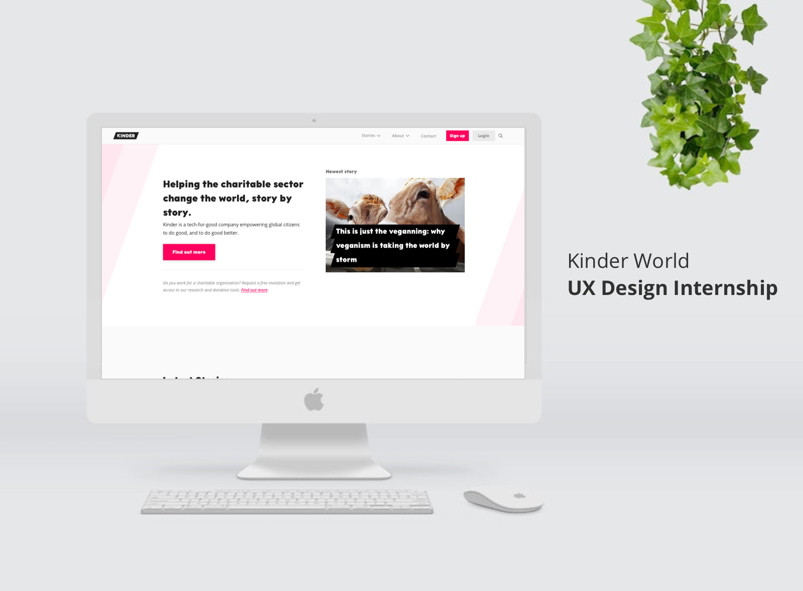
About Kinder World:
Kinder World supports charitable organisations by raising funds, creating awareness and increasing their impact. It also helps donors to find trustworthy organisations.
Role: UX Designer
Duration: 3 months
Categories: UX Research, Information Architecture, Prototyping
Tools: Sketch, Zeplin, Keynote, trello
Problem:
1. No clear path for Kinder World's users (Donors and Organisations) to join Kinder World.
2. There are multiple titles on the homepage header that are misunderstood by its users.
Process:
User research -> Ideate -> Prototype -> Test -> Design
Research:
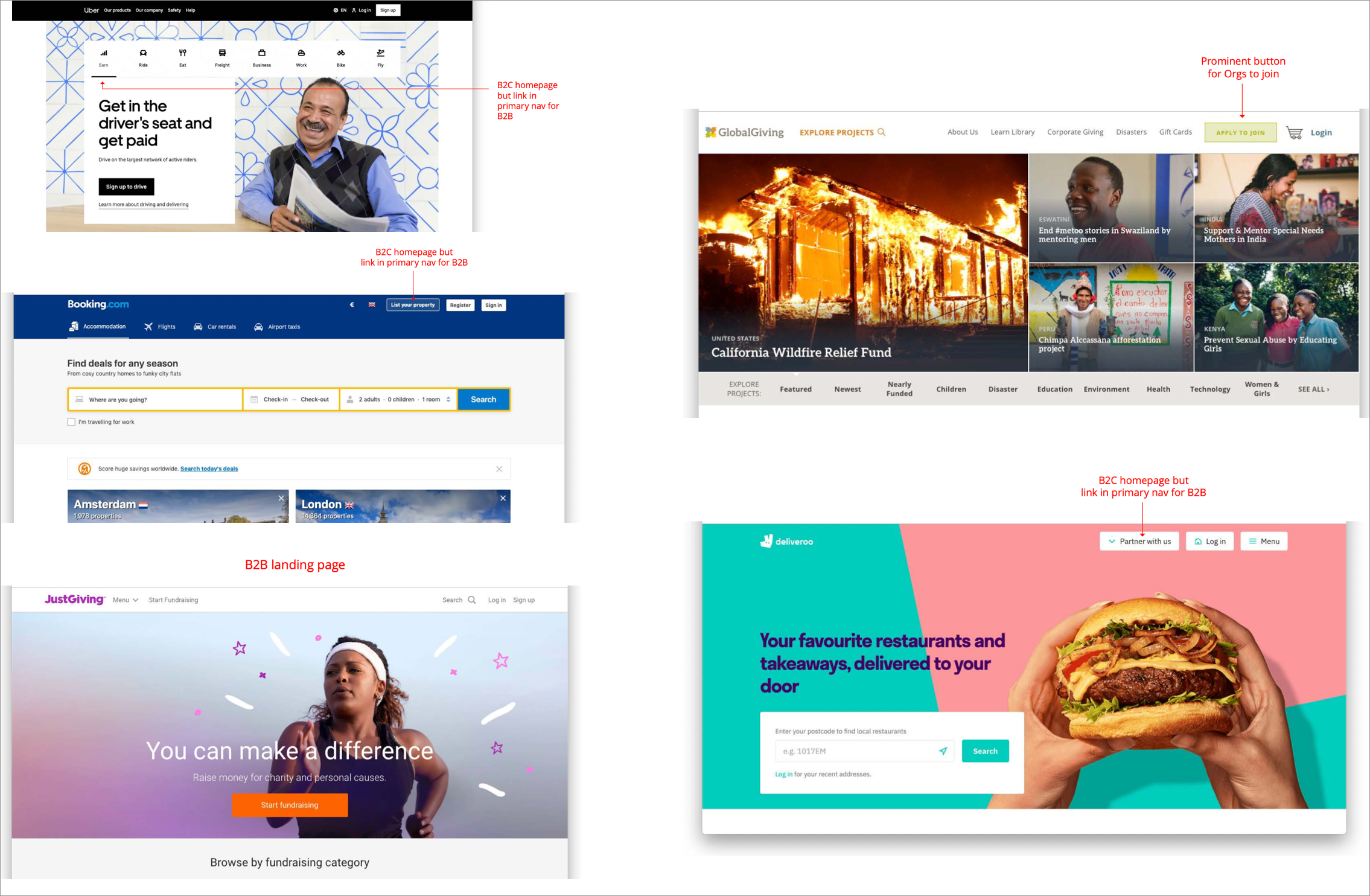
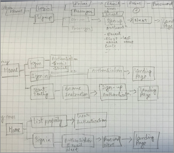
Explored and deep dived sign up and login pages, observed user journeys in similar industry and in companies that has multiple users (B2B & B2C).
Competitior analysis
Design:
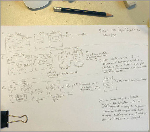
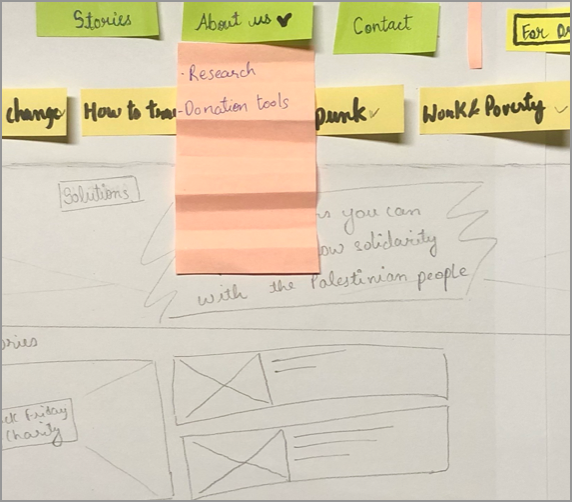
After sorting through requirements and research data, I went through several iterations of design, moving back and forth between sketches and low-fidelity wireframes before moving to higher fidelity mockups and prototyping.
Usability test:
I conducted a usability test to understand the gaps in the navigation design for user sign up and login journey. I tested two different designs of navigation (A&B) with 5 users chosen from different backgrounds.
Design A: that leads to login/sign up options
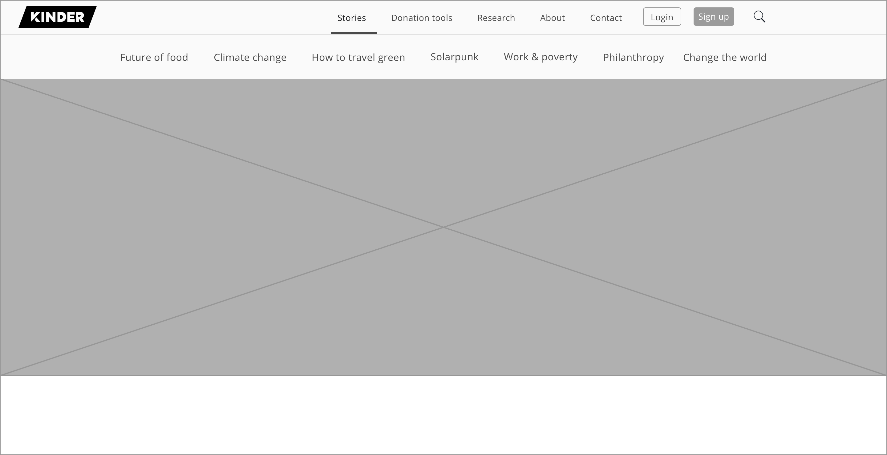
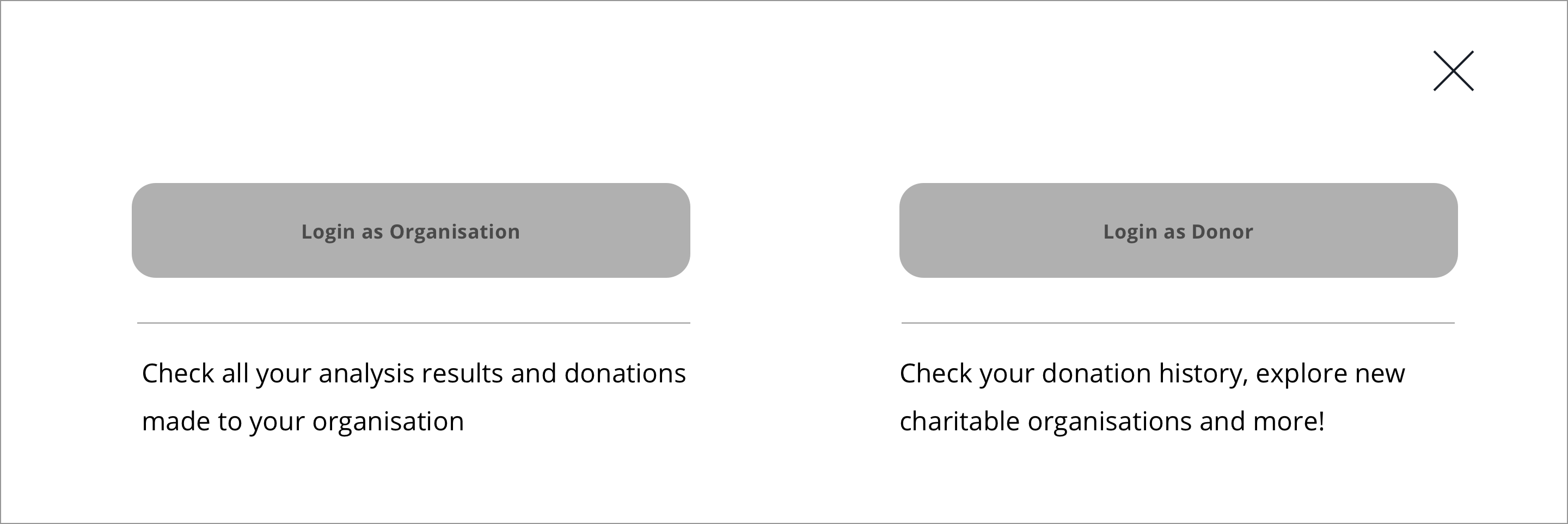
- All users were able to complete their tasks easily.
- Two users got distracted by the titles on the nav bar which don't look like story names.
- Few users would like to see a motivational video about Kinder World on the homepage.
Design B: with only login option on home page
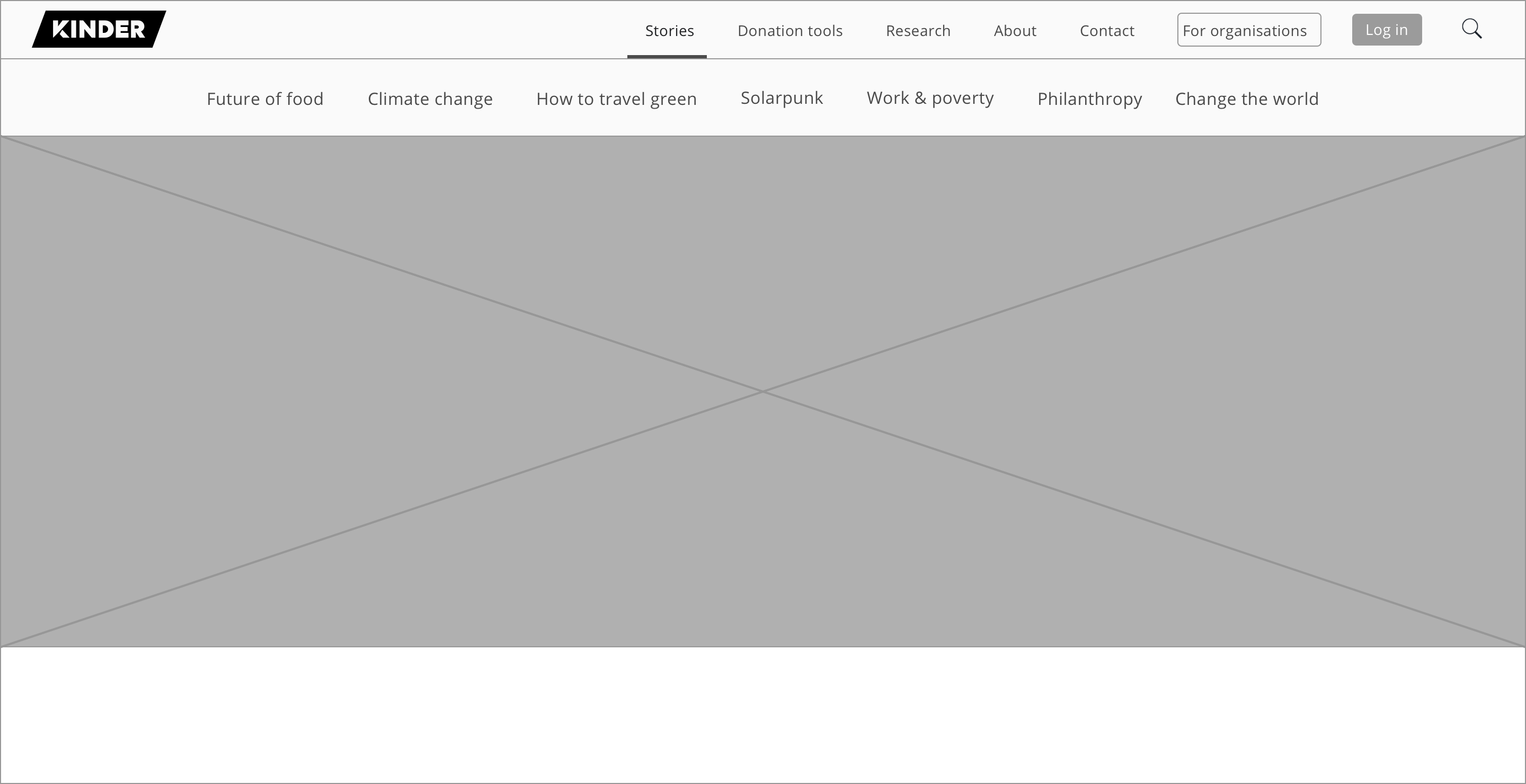
- Only few users were able to complete their tasks easily, rest users took more time to complete it.
- A user clicked on ‘Donation tools’ title on the top-nav bar to check donation history which was incorrect.
- Few users suggested to see some motivational content to join Kinder World on the homepage before creating an account.
After analysing the two user testing observations I decided to go with Design A
Kinder World homepage current design: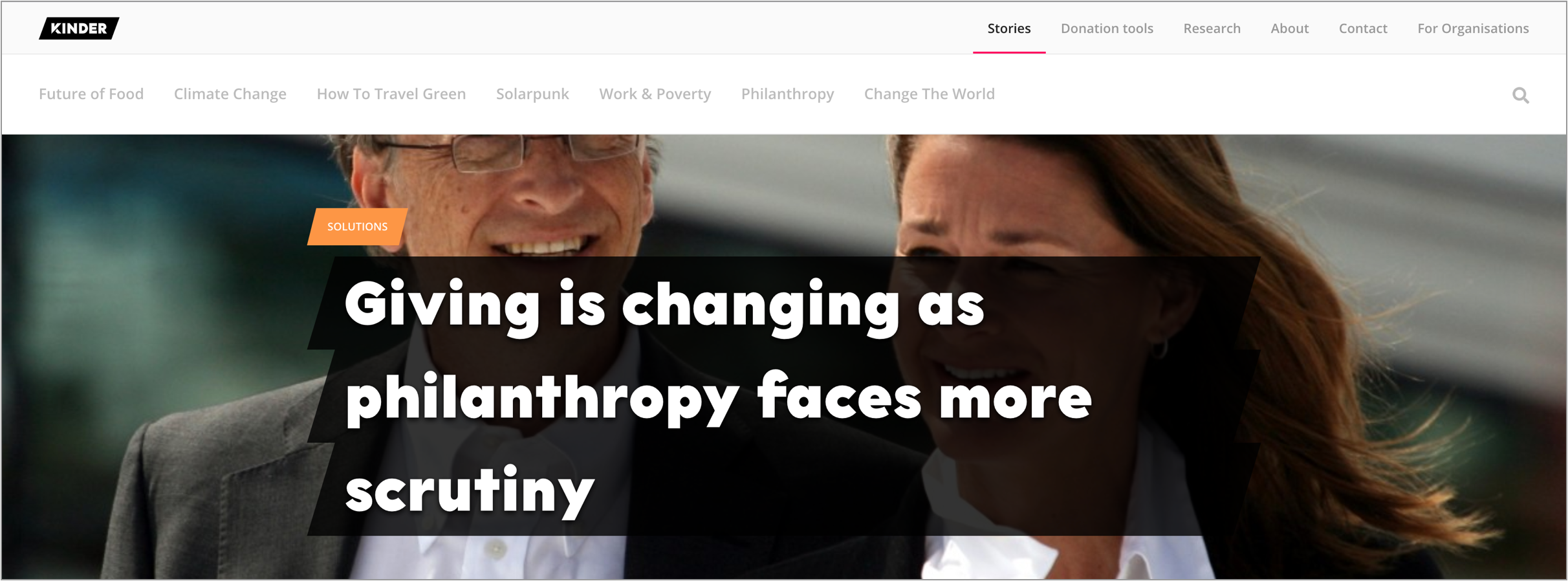
Kinder World homepage proposed design:
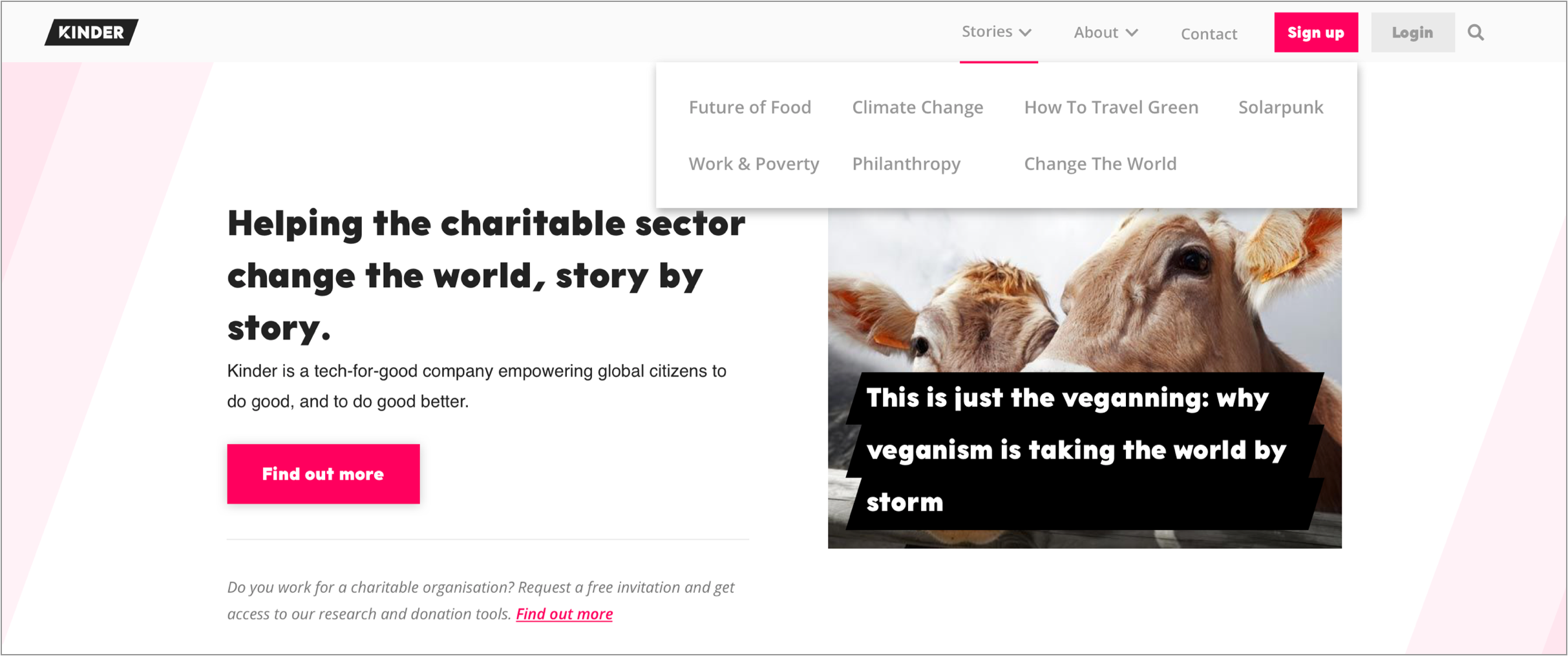
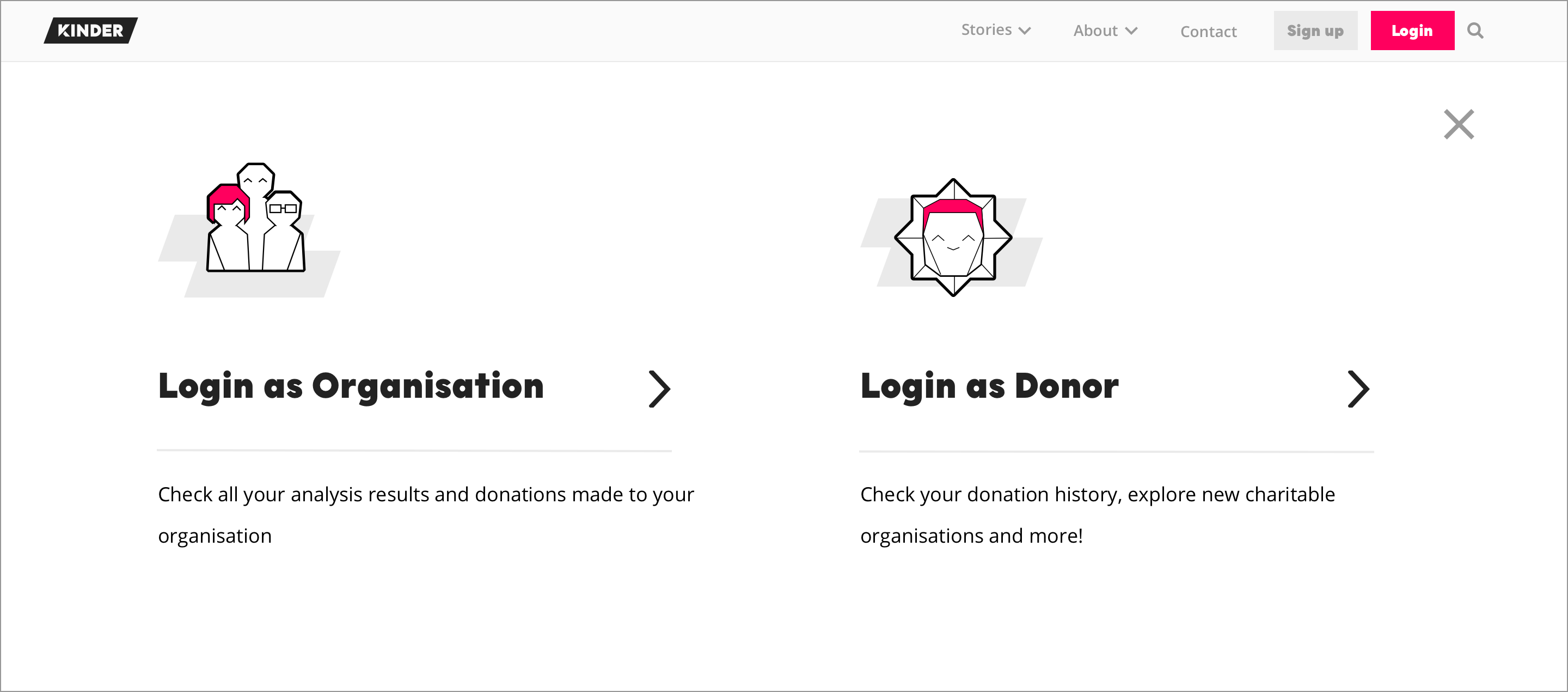
Design Inspiration:
Uber, GlobalGiving, Deliveroo, Booking.com
Design UI:
Kinder already has the design system in place, so it was easy for me to create hi-fidelity prototype.